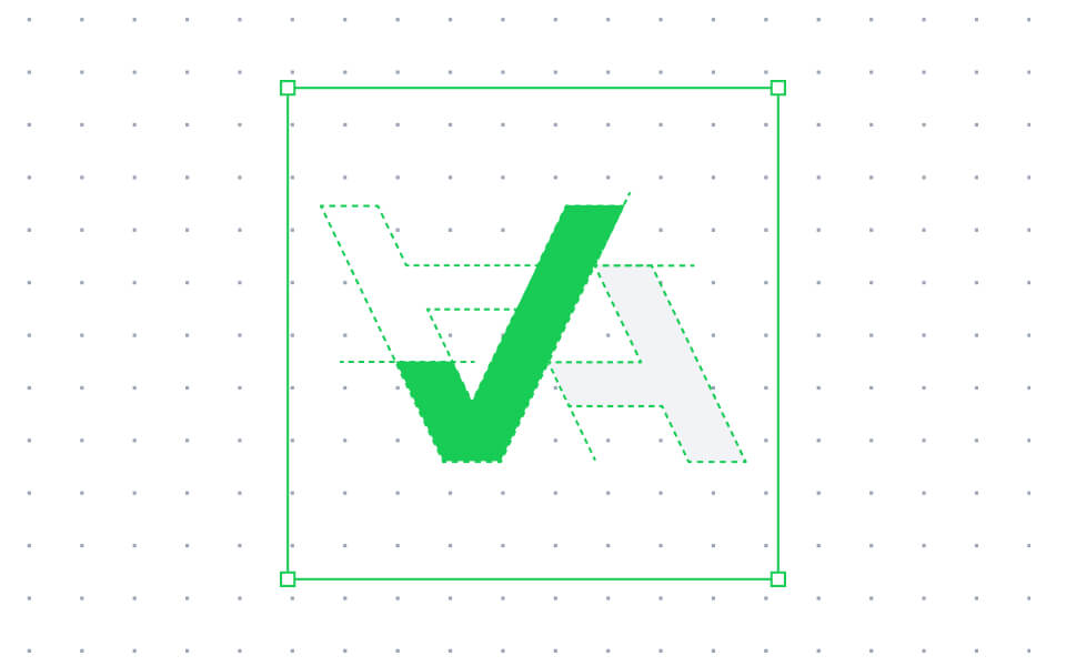
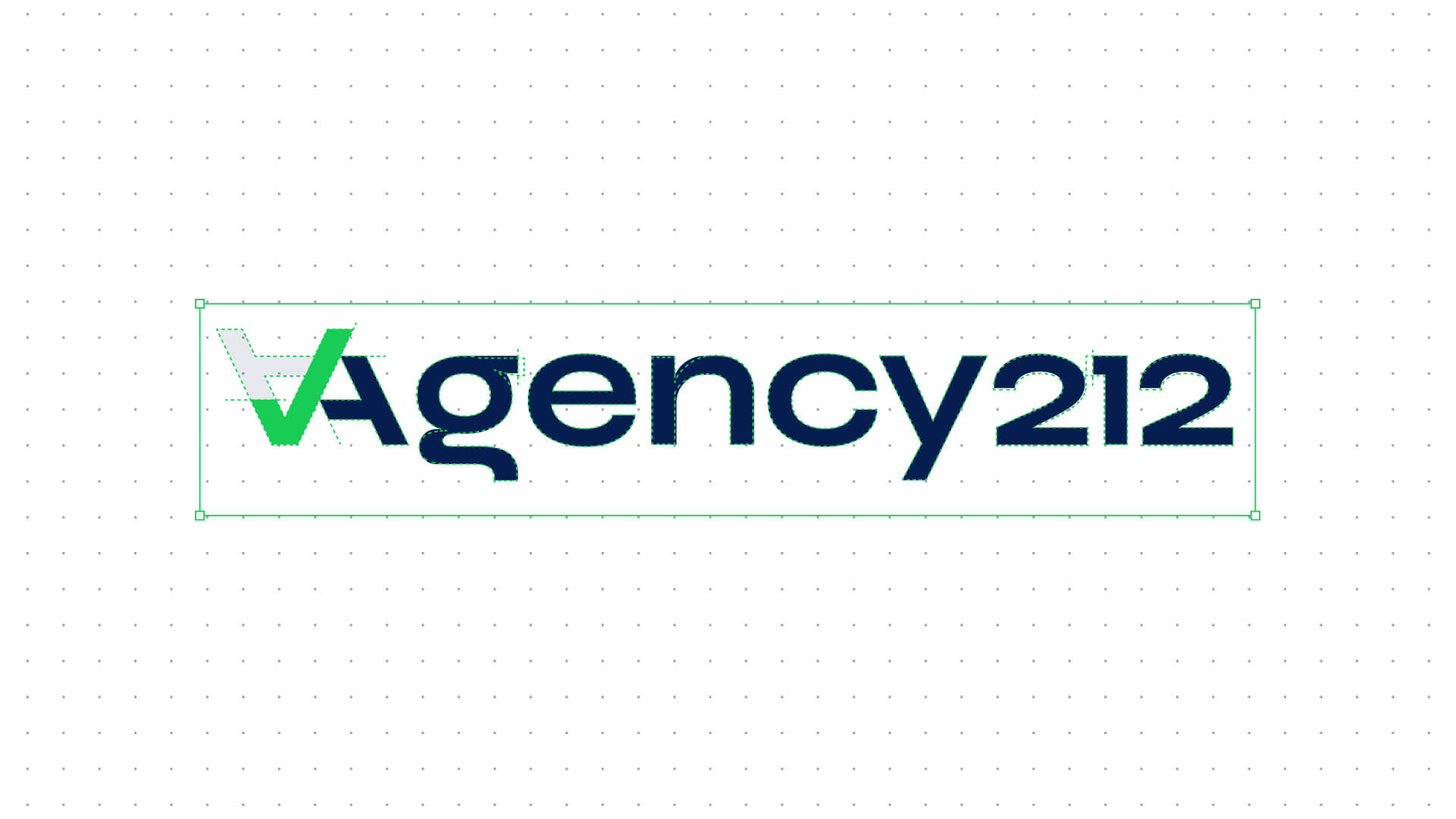
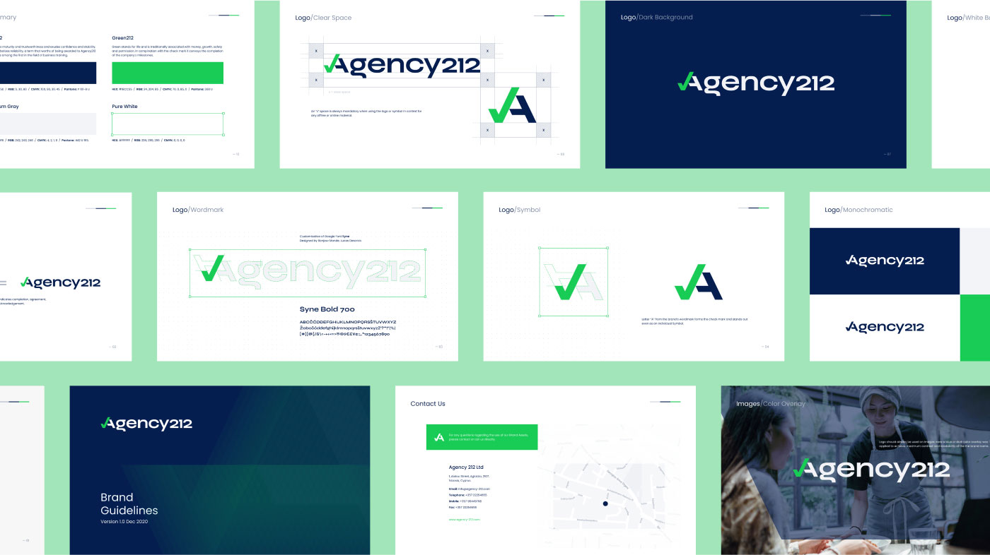
In this project, I led the redesign of the company’s logo, incorporating an inverted initial “A” that cleverly formed a check mark. This new logo symbolized completion, agreement, correctness, and acknowledgement, encapsulating the values of excellence embraced by Agency 212. I also played a pivotal role in the creation of brand guidelines to ensure consistent visual impact across digital and offline applications.
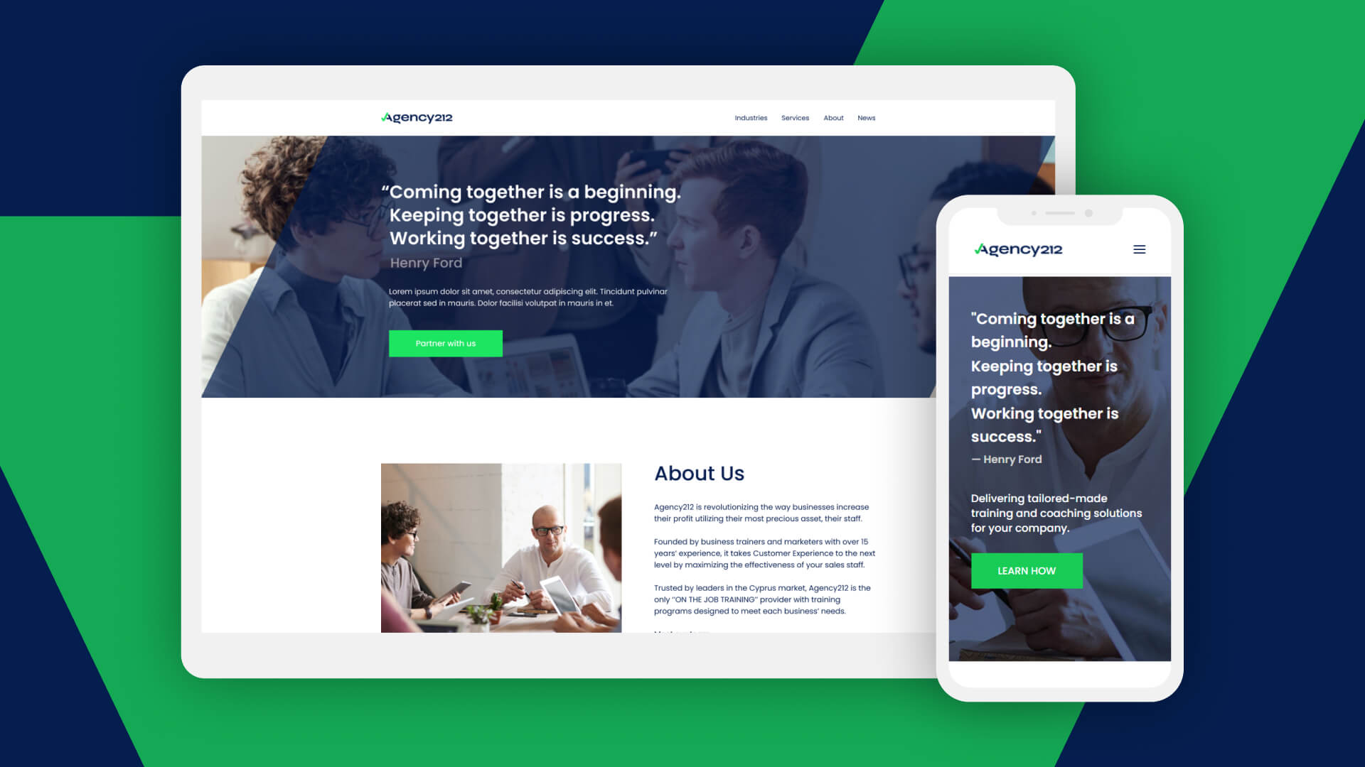
The design journey extended to a minimal and intuitive informational website, crafted in line with the brand colors of blue and green. Fully responsive for mobile devices, the website was developed using the WordPress framework, providing a seamless user experience. Additionally, I contributed to the creation of a promotional flyer targeting hotels for the Hospitality Personnel Training Programs.
